Climate change visualizations: Why? Climate change is one of the biggest threats to society in the 21st century, and strong action is required to reduce anthropogenic global warming. The Paris Agreement’s long-term goal is to keep the global average temperature well below +2.0°C above pre-industrial levels and to limit the increase to +1.5°C since this would substantially reduce the risks and effects of climate change.
Talking about climate change becomes crucial to increase awareness of this societal problem in the population and thus – ultimately – to stimulate governments to act on climate. On this page, you find freely available climate change visualizations designed for the public and aimed at being used as a means for stimulating discussion on climate change. Feel free to use any of these visualizations for climate communication purposes (for example, on social networks, for talks, or while chatting with your neighbour). If you like, let me know how you use them!
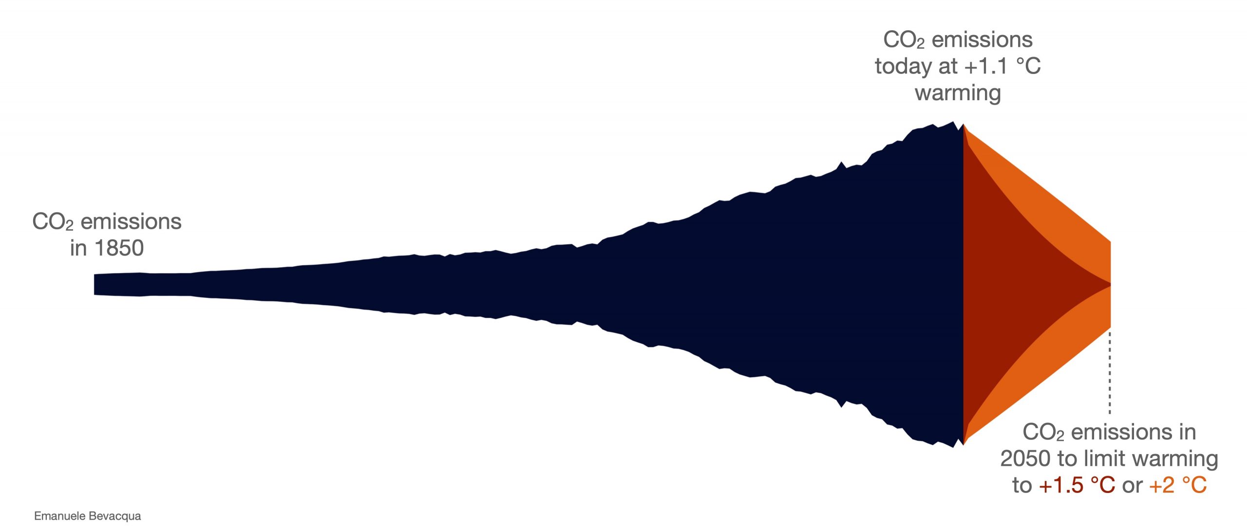
An uncomfortable tie: reduction in CO2 emission required to limit global warming To limit global warming, we need to reduce greenhouse gas emissions, including CO2 emissions. Based on data from the IPCC AR6 Synthesis Report, this plot highlights that to limit global warming to 1.5 °C or 2 °C in line with the Paris Agreement’s target, global CO2 emissions should decline drastically.
From left to right in dark blue, the rise of CO2 emissions from 1850 to today (around 2020) when global warming is at about +1 °C compared to the pre-industrial period. After today, in orange/red, the image shows the drastic reduction in CO2 emissions required up to 2050 to limit, with a probability of 50-67%, global warming to 1.5°C (with no or limited overshoot) or 2 °C. The figure is based on data from the IPCC AR6 Synthesis Report (Table SPM.1), combined with observed CO2 emissions. The visualization was developed in August 2023.
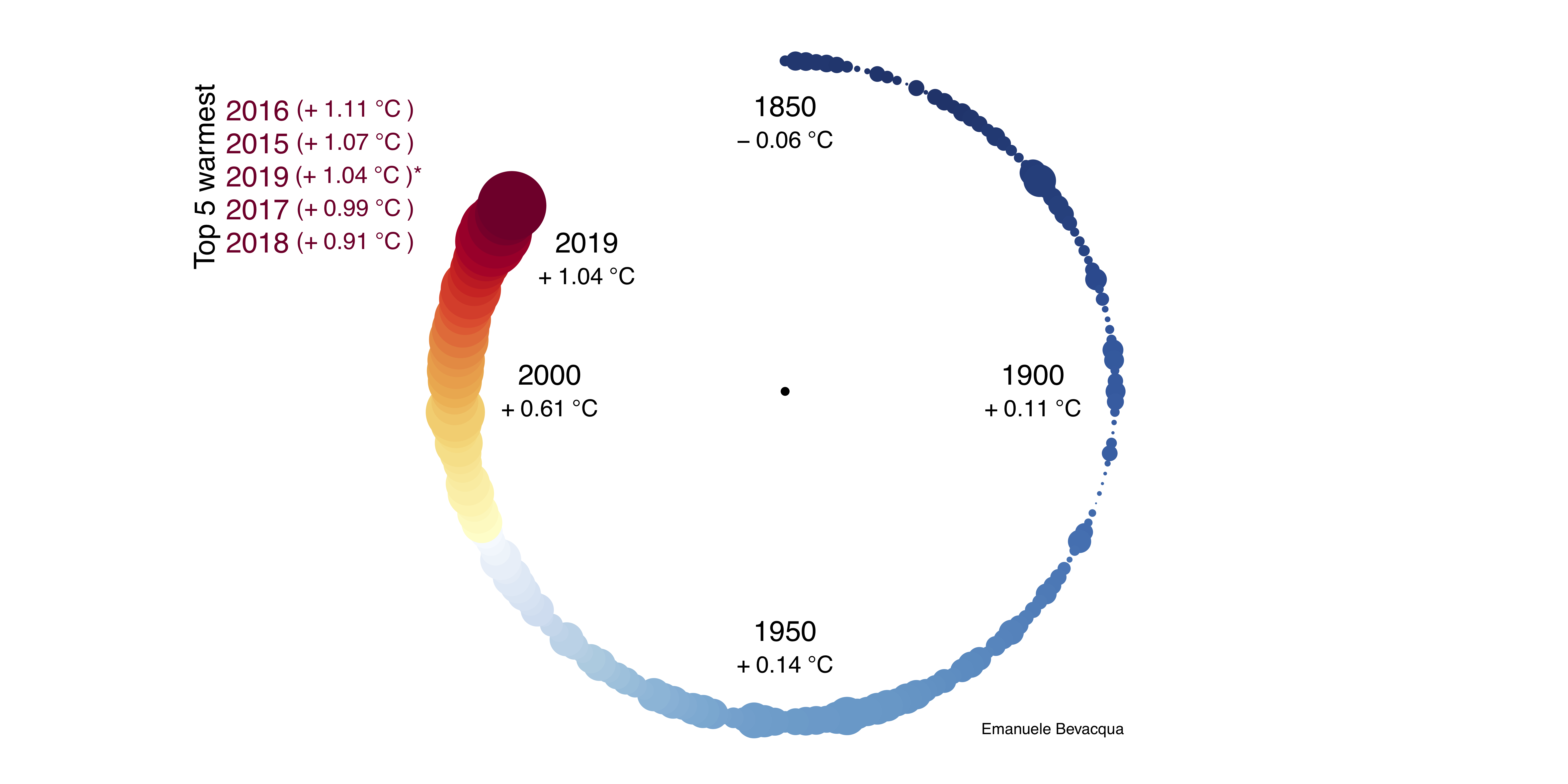
Global warming clock (or…coffee plot) This “global warming clock” shows the rise of mean global temperature (point size) and CO2 concentration (colour): it highlights that the time for taking action on climate change is running out. While the Paris Agreement’s target is to keep the mean global temperature below +1.5/+2.0°C above pre-industrial levels, this clock shows that we already reached +1.11°C in 2016. Interestingly, the visualization was named by some people as “the coffee plot” as it looks like a coffee stain.
Mean global temperature and CO2 concentration anomalies during 1850 to 2017 relative to the pre-industrial period (1850-1900). Time runs as in a clock. The temperature of each year is represented as a point whose size increases with the temperature anomalies. CO2 concentration is represented by colours (blue/red representing lower/higher values of CO2). Data: CO2 from scrippsco2-ucsd; Temperature from HadCRUT4. The visualization was developed in October 2018. Download high quality image: [(1×1) format][(2×1) format].Update (1850-2019; 2019 up to October). See additional information here.
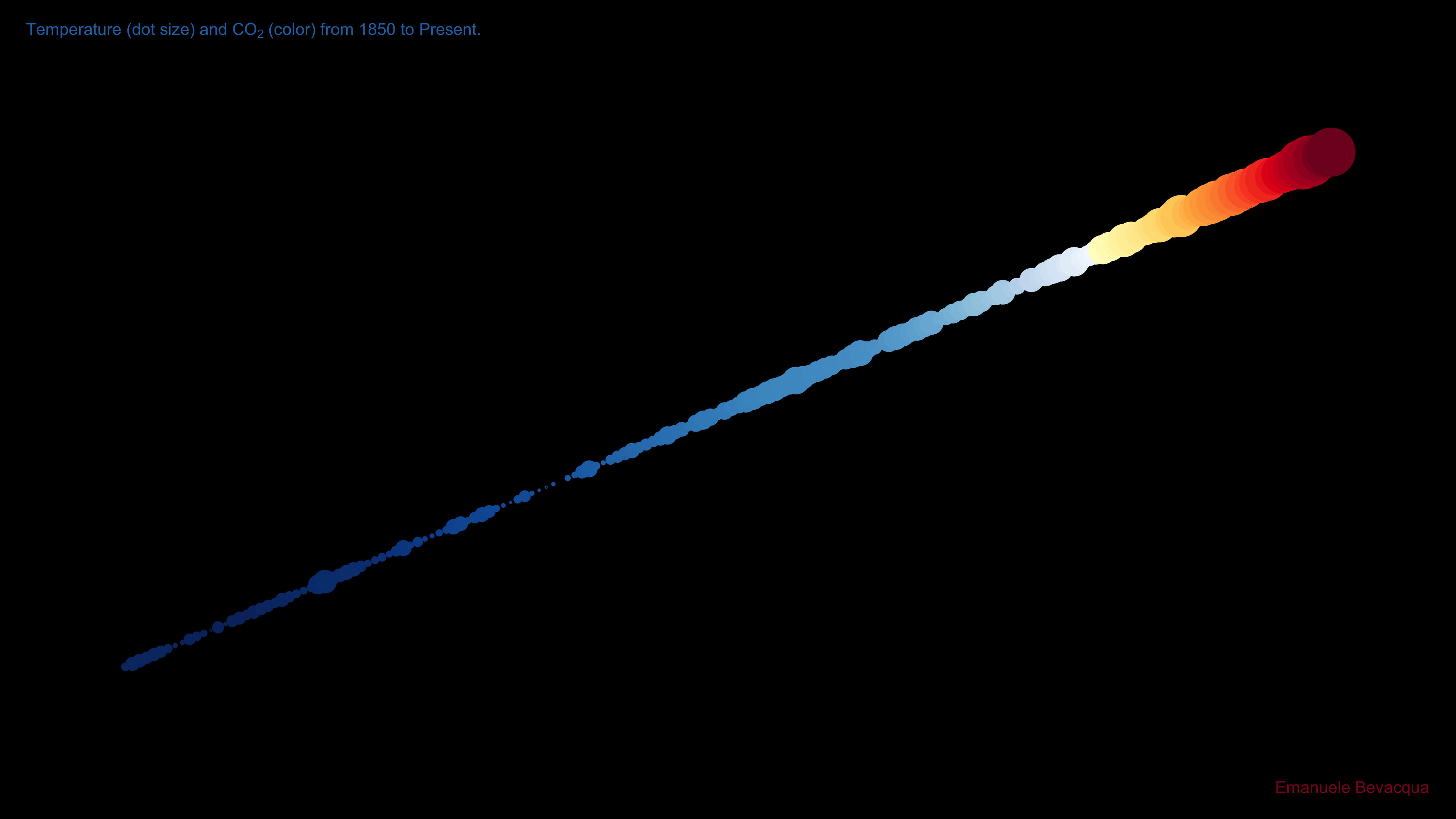
Warming Meteorite
Mean global temperature anomalies with respect to the pre-industrial level (that is, here, 1850-1900) and CO2 concentration, from 1850 to 2019. Time runs bottom-left to top-right. The temperature of each year is represented as a point whose size increases with the temperature anomalies. CO2 concentration is represented by colours (blue/red representing lower/higher values of CO2). Data: CO2 from scrippsco2-ucsd; Temperature from HadCRUT4. The visualization was developed in February 2021.
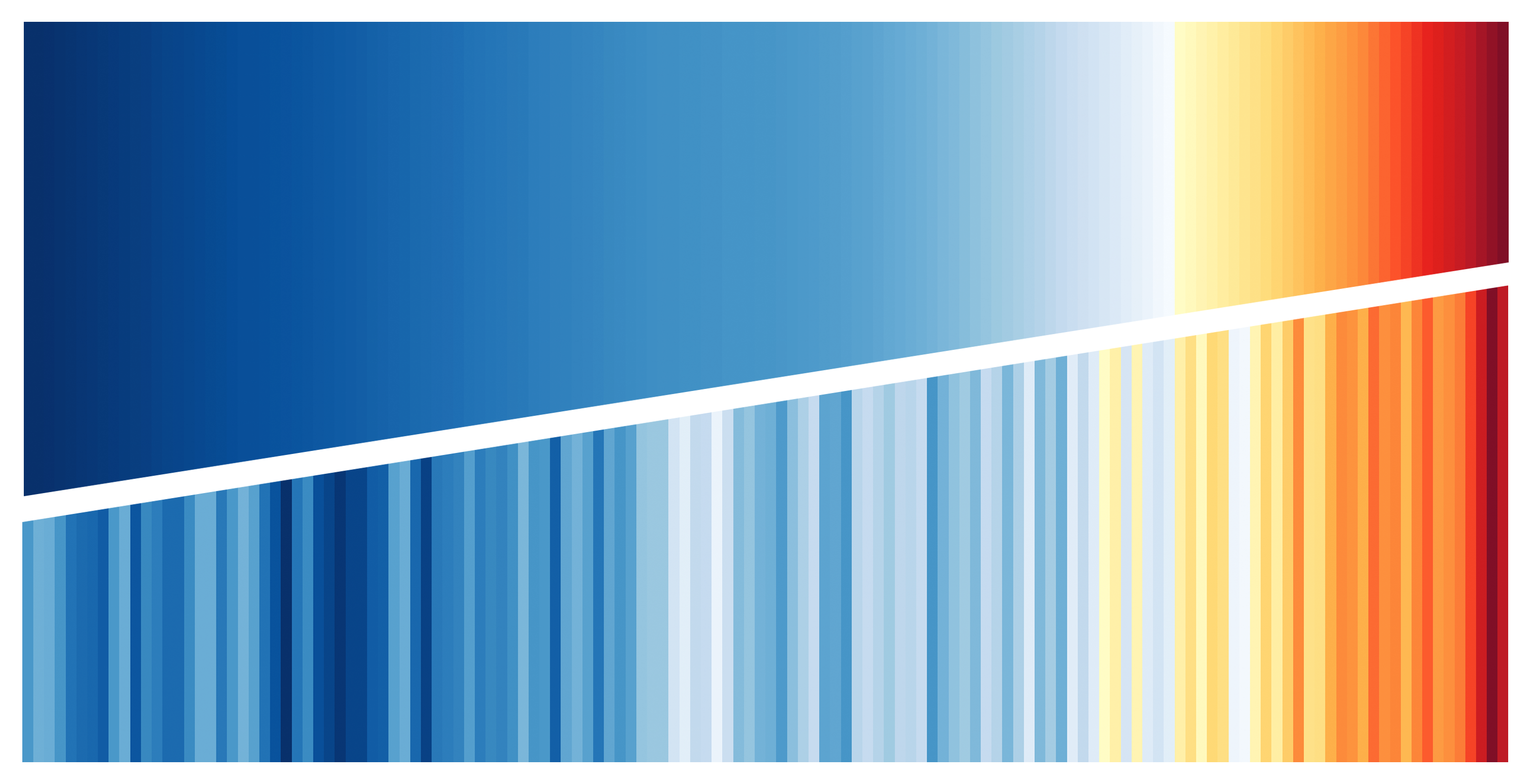
Temperature and CO2 warming stripes Warming stripes are a very simple, nice, and efficient visualization of global/local warming invented by Ed Hawkins. Time (in years) runs from left to right in the panel. The temperature of each year is represented by colour, with blue/red representing colder/warmer temperatures. The image below differs from the original warming stripes as it combines the visualization of mean global temperature and CO2 concentration. It shows a clear positive trend in the variables, with an acceleration of both the warming and the CO2 concentration in the last decades (right part of the panel).
Mean global temperature (bottom panel) and CO2 concentration (top panel) increasing from 1880 to 2017. Lower/higher values of temperature and CO2 are represented in blue/red. Data: CO2 from scrippsco2-ucsd; Temperature from GHCN and ERSST. The visualization was developed in August 2018.
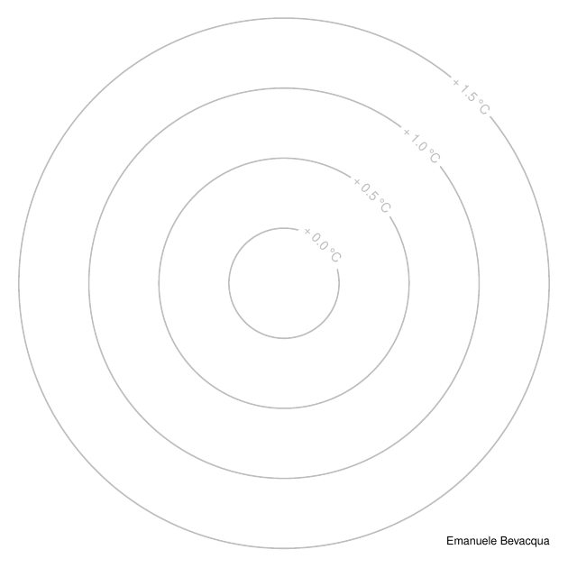
Circular Warming Stripes
Mean global temperature from 1900 to 2017. Each circle represents the temperature in a single year. Inner circles show the temperature in the past, and external circles show the temperature in recent years. Temperature data from HadCRUT4. The visualization was developed in November 2018. Download high quality image: [(2×1) format][(1×1) format].Mean global temperature (upper half of the circle) and CO2 concentration (lower half) from 1900 to 2017. Each half circle represents the temperature/CO2 in a single year. Inner circles show the temperature and CO2 in the past, and external circles show the temperature and CO2 in recent years. Data: CO2 from scrippsco2-ucsd; Temperature from HadCRUT4. The visualization was developed in November 2018. Download high quality image: [(2×1) format][(1×1) format].
Running warming dots
Annual mean global temperature anomalies with respect to pre-industrial levels (that is, here, 1850-1900) from 1880 to 2017. Temperature is represented by coloured circles (blue/red representing colder/warmer temperatures) whose radius increase with temperature. See the background grey circles as reference for temperature values. (The image does actually look like the popular “climate spirals” realized by Ed Hawkins.) Temperature data from HadCRUT4. The visualization was developed in November 2018.Monthly mean global temperature anomalies with respect to pre-industrial levels (that is, here, annual mean during 1850-1900) from 1900 to 2017. Temperature is represented by circles whose radius increase with temperature. Also, temperature anomalies are ranked separately for each month: blue/red colours represent colder/warmer observation within a fixed month; the three top warmest observations within a month are highlighted via showing the temperature anomalies. See the background grey circles as reference for temperature values. Temperature data from HadCRUT4. The visualization was developed in November 2018.
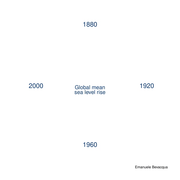
Sea level rise
Global mean sea level rise from 1880 to 2013. Time runs as in a clock. The sea level rise level on each year is represented as a coloured point (darker blue for higher sea level values) whose size increases with sea level rise. Data from the updated version of the reconstruction of Church and White (2011). The visualization was developed in November 2018.
All of the images on this page are realized using the software R.

![[(1×1) format]](https://emanuele.bevacqua.eu/wp-content/uploads/2018/11/WarmingClock3_1x1.jpg)
![[(2×1) format]](https://emanuele.bevacqua.eu/wp-content/uploads/2018/11/WarmingClock3_2x1.jpg)
![[(2×1) format]](https://emanuele.bevacqua.eu/wp-content/uploads/2018/11/WarmingStripesCircular_2x1.jpg)
![[(1×1) format]](https://emanuele.bevacqua.eu/wp-content/uploads/2018/11/WarmingStripesCircular_1x1.jpg)
![[(2×1) format]](https://emanuele.bevacqua.eu/wp-content/uploads/2018/11/WarmingStripesCircular_CO2-Temp_2x1.jpg)
![[(1×1) format]](https://emanuele.bevacqua.eu/wp-content/uploads/2018/11/WarmingStripesCircular_CO2-Temp_1x1.jpg)